--------
Most of us can look at an object and quickly decide if it is ‘good’ or ‘yuk’. But trying to analyse just what it is that makes something look good requires knowledge. There are many ways of analysing design; this is just one way of looking at it and thinking about it.
In my years as an art teacher, I have found the Elements and Principles of Design as a very useful way of looking at art and design, and I consider them as the two fundamentals. You might like to think of the ELEMENTS as a series of tools you can use, and the PRINCIPLES as the methods you can apply in using them. There are some crossovers between these ideas, and you will find that each element or principle rarely works in isolation.
Colour
Colour is a whole area of study on its own and many books have been written about it.
Colour is sometimes referred to as hue. There are three primary colours (red, yellow, blue), which can be mixed to form secondary colours (orange, green, purple), and tertiaries (those colours in between the primary and secondary colours). Colours can be darkened with black (tone) or lightened with white (tint). There are infinite variations that can be achieved.

When choosing colours to co-ordinate, use the colour wheel as a guide; here are some basic ideas.
1. Two colours that are directly opposite each other on the colour wheel look good together, and are referred to as complementary, e.g. yellow and violet.
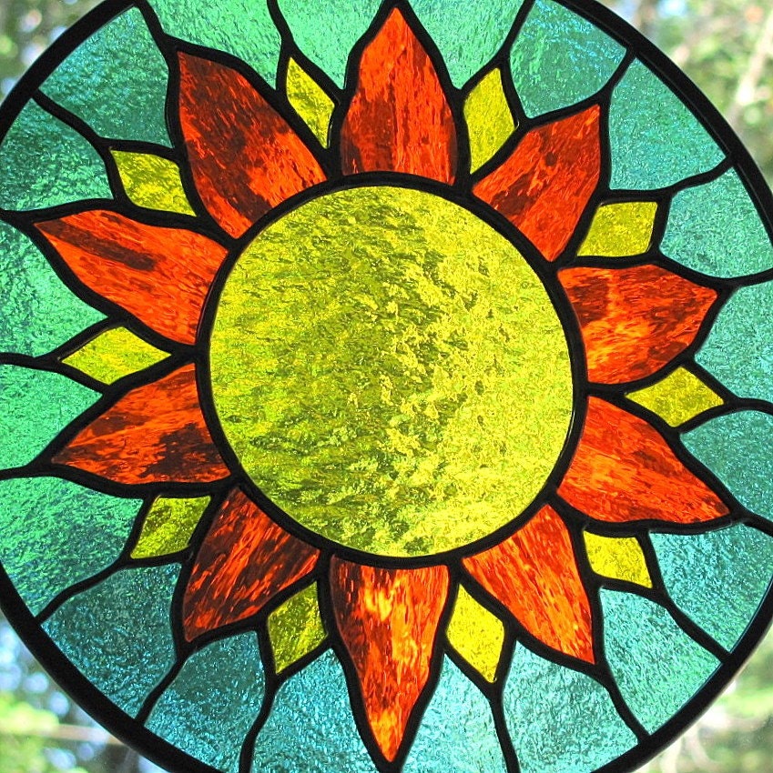
2. Three colours that are equally spaced from each other on the wheel, forming an equilateral triangle (triad), also look good, e.g. blue-violet, yellow-green, and red-orange.
3. Two or three colours right next to each other on the wheel are called harmonious, and look good, e.g. violet, blue-violet, blue.
4. Monochromatic means sticking fairly closely to one hue, but in different tones (shades of dark & light)
When choosing colours, also consider the value of the colour – dusky pink will probably look terrible with a clear bright red, even though they have a similar base hue.
There is so much more you can do with colour; if you are feeling confident, I would encourage you to explore this area further – check your local library.
For lots of us, it's often better to look at theory in practice.
COMPLEMENTARY COLOURS

from Gaialai
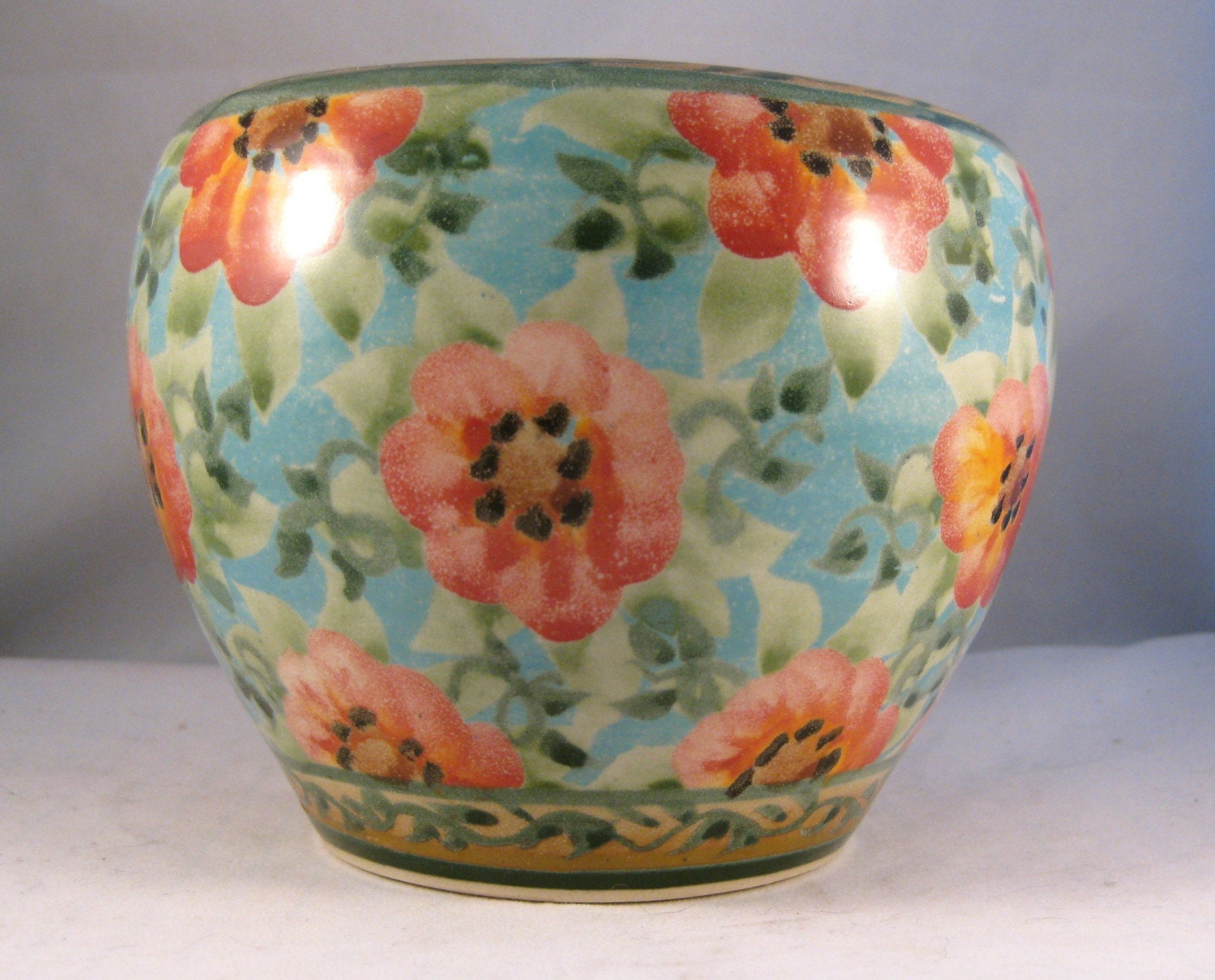
from SandyKreyer Kiln House Pottery
HARMONIOUS COLOURS
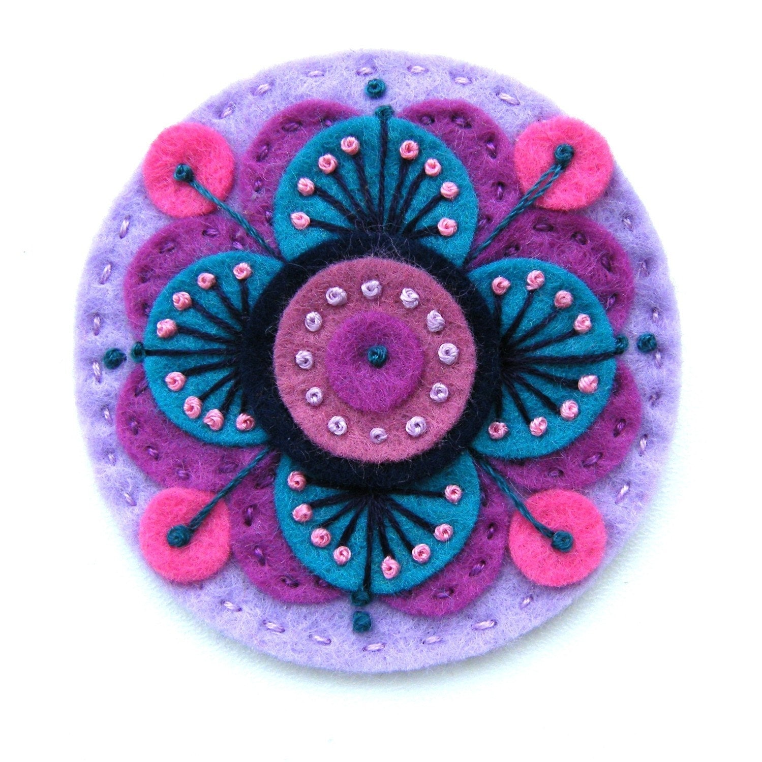
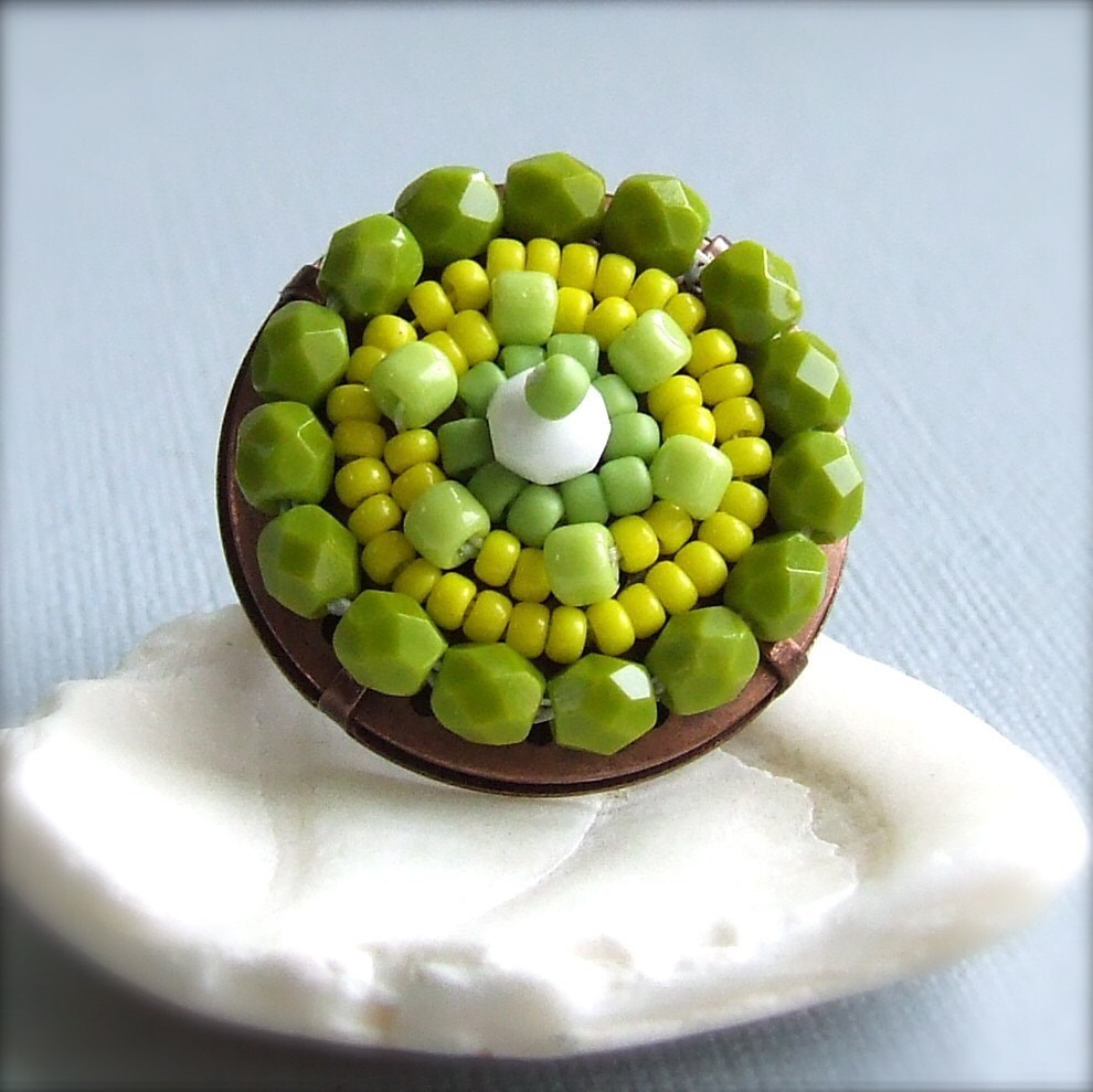
blue, red, and yellow

from
MONOCHROMATIC
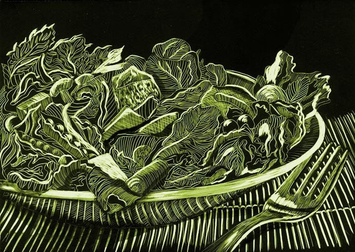
Salad Monochromatic, scraperboard,
from naquaiya

from RawHemline
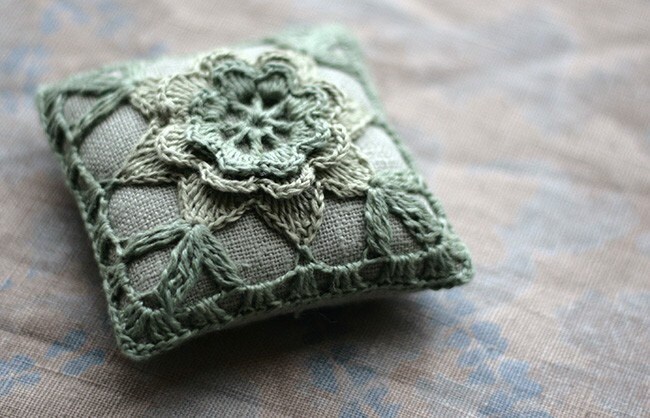
from namolio
Some of my favourite blogs that love colour ;
- Color Collective - http://color-collective.blogspot.com/ - colour palettes of the day
- Cassia Beck http://cassiab.blogspot.com/ - photography with quite a particular palette
- House of Turquoise (Pantone's colour of the year!) - http://www.houseofturquoise.com/
- How about Orange - http://howaboutorange.blogspot.com/
Have fun!!!