Hiya all, it's been a VERY long time since I posted on this blog....
But I just wanted to let you know (well at least those of you who still happen to pass by) , that I am in the process of re-inventing my blog, and moving to beautiful new premises over here. It will be featuring things that are dear to me, centred around contemporary craft, surface design, and books - AND I will be posting several times a week, so there will be always something new to see.
I do hope you'll join me in this new phase of my journey. You can subscribe to the new blog and get the posts by email too, so you don't miss anything!
The address is http://tractorgirl.com.au
See you there.
x
Julie
Friday, November 18, 2011
Monday, October 18, 2010
Design Basics Part 2 - Line
Welcome to the second instalment of my occasional series of articles on some of the ideas surrounding Design. My intention remains the same ~ to demystify some of what makes good design good.
As noted HERE the basics of Design can be thought of as a set of ELEMENTS and PRINCIPLES. The next Element to investigate is LINE.
Line ~ can be an actual line drawn, or can be the line formed where two surfaces, or surface and space meet.
Line can lead your eye in a particular direction, as can shape, eg. Arrow.
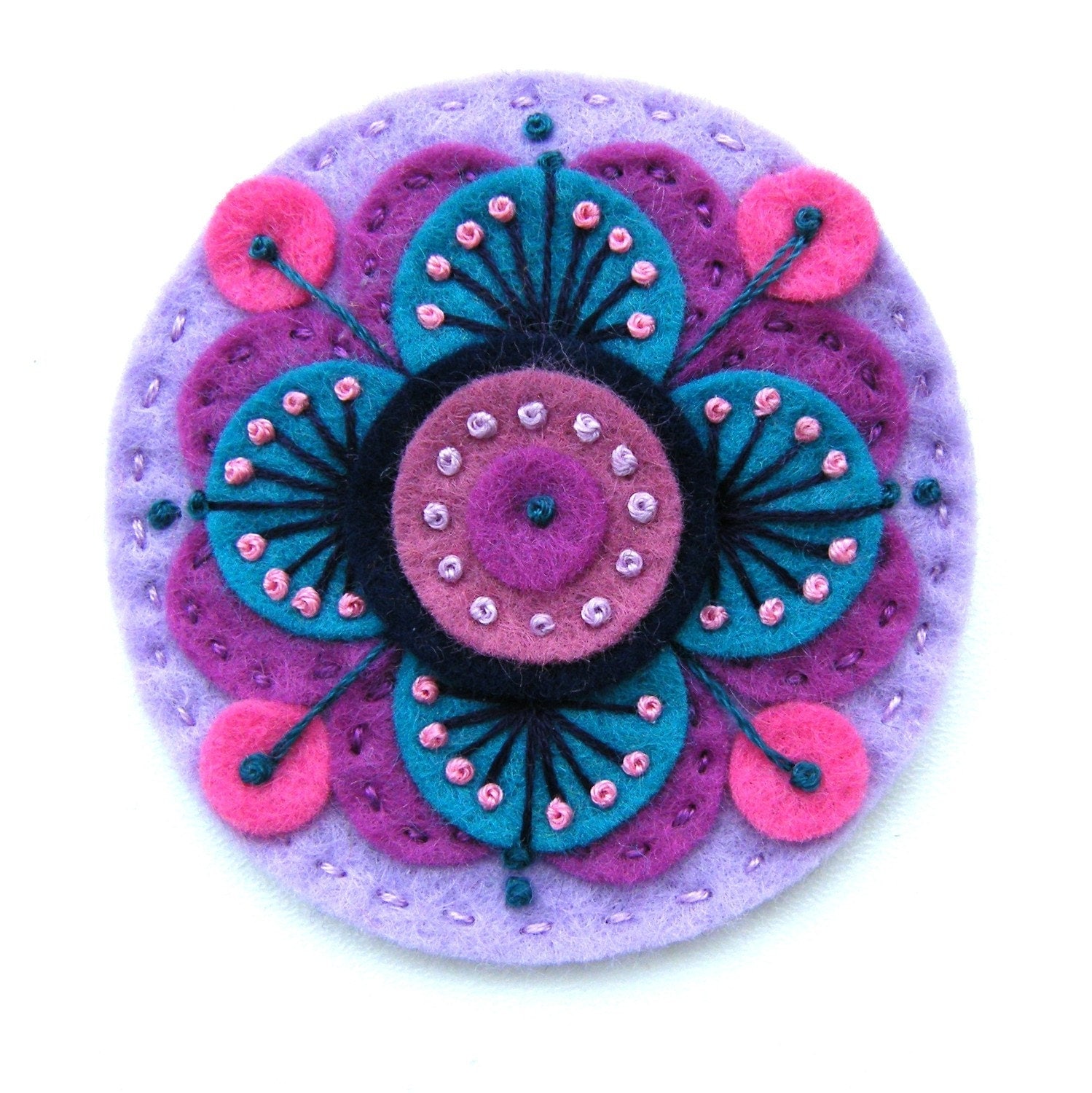
On a round shape, our eyes are usually drawn first to the centre. In this plate, our eyes then work through the successive bands, helped along by the general direction of the lines in each band of pattern.
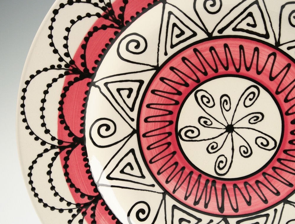
from OwlCreekCeramics
Form and depth can be built up with simple layering of lines.
from BridgetFarmerPrints
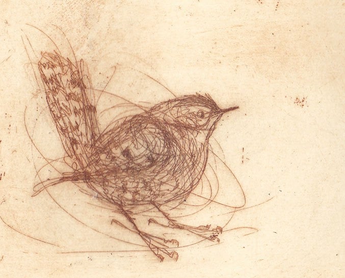
Depth and movement can be created depending on the thickness of the line. Our eyes continue to move up and down the flowing shapes. The lighter lines tend to come 'forward', while the darker lines tend to recede.
By varying the thickness and density of the line, you can convey a sense of real form and weight. Generally, lines are thicker and darker where there is shadow. Note the subtle change in thickness on the ribs, of the left of the body (ie the upper line)

Bending Figure, charcoal drawing
from catalinaviejo
Diagonals create movement and/or vitality, as in this image of a fresh flower laden branch. Strength is gained through the simplicity of the composition, and the heaviness and repetition of the tapered lines.

from JessicaDoyle
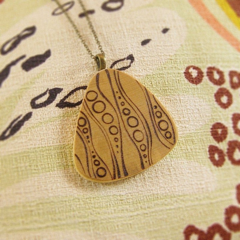
Line can be both delicate and gutsy.
from Fiddlebones
Like colour, there is so much you can do with line, and I've only just touched the tip of the iceberg here. As always, I love your comments and questions. So go on, drop me a line! :)
Stay tuned for the next post on Size.... (yes, it DOES matter)
Wednesday, September 8, 2010
to market to market to buy a fat pig...
I am very nervous and excited to be in the midst of organising my very first handmade market! At the Wagga Beach (yes, Wagga DOES have a beach ~ on the river, of course ;P). Besides being my first market, it's also the first boutique Handmade market for Wagga - I am sssooooo curious to see how it goes. I grew up here; it is pretty conservative, in the middle of a large sheep/wheat farming region (hang on, I'm a wheat/sheep farmer too? well, MOSTLY conservative).
So far -
* Trying to make oodles of stuff, 'cos I just KNOW it'll be a sell-out! (well, one can dream :D)
* Got my biz cards organised
* Packaging - thinking about some nice paper carry bags with 'tractorgirl' rubber stamped on them, but because they have to be a bit larger to fit cushions and the like, these might prove to be a bit too expensive (would love some other suggestions!)
* Display? Some ideas, but really, no idea yet. Gotta get seriously working on this one. Cushions, little bags, teacosies, fabric brooches, perhaps even some big bags using reverse applique designs like those on my cushions.
Here's some of the little reversible bags I've been working on -

I've got until 9th October......
And the pig? Well, it's tenuous, but 'pig' kinda fits with 'muddi'... you can learn more about the market here - http://www.muddiboutiquemarkets.com/
I'll keep you posted as things progress!
Sunday, August 29, 2010
Design Basics - Part 1 - Colour
What makes good design work? Sure, it's 'what you like', but if 90% of people agree that they 'like' something, isn't it possible that there is something more fundamental than personal taste happening there? This is the first part in an occasional series of articles I am writing on some of the ideas surrounding Design, and my intention is hopefully to demystify some of what makes good design good.
--------
Most of us can look at an object and quickly decide if it is ‘good’ or ‘yuk’. But trying to analyse just what it is that makes something look good requires knowledge. There are many ways of analysing design; this is just one way of looking at it and thinking about it.
In my years as an art teacher, I have found the Elements and Principles of Design as a very useful way of looking at art and design, and I consider them as the two fundamentals. You might like to think of the ELEMENTS as a series of tools you can use, and the PRINCIPLES as the methods you can apply in using them. There are some crossovers between these ideas, and you will find that each element or principle rarely works in isolation.
Colour
Colour is a whole area of study on its own and many books have been written about it.
Colour is sometimes referred to as hue. There are three primary colours (red, yellow, blue), which can be mixed to form secondary colours (orange, green, purple), and tertiaries (those colours in between the primary and secondary colours). Colours can be darkened with black (tone) or lightened with white (tint). There are infinite variations that can be achieved.

Colour, and colour combinations can be clear, muted, loud, subtle, pale, strong, murky, and more. They can be utilised to enhance the ‘mood’ of a piece – cheerful, romantic, bold, fresh, or more.
When choosing colours to co-ordinate, use the colour wheel as a guide; here are some basic ideas.
1. Two colours that are directly opposite each other on the colour wheel look good together, and are referred to as complementary, e.g. yellow and violet.
2. Three colours that are equally spaced from each other on the wheel, forming an equilateral triangle (triad), also look good, e.g. blue-violet, yellow-green, and red-orange.
3. Two or three colours right next to each other on the wheel are called harmonious, and look good, e.g. violet, blue-violet, blue.
4. Monochromatic means sticking fairly closely to one hue, but in different tones (shades of dark & light)
When choosing colours, also consider the value of the colour – dusky pink will probably look terrible with a clear bright red, even though they have a similar base hue.
There is so much more you can do with colour; if you are feeling confident, I would encourage you to explore this area further – check your local library.
For lots of us, it's often better to look at theory in practice.
COMPLEMENTARY COLOURS

HARMONIOUS COLOURS
COLOUR TRIAD
Have fun!!!
--------
Most of us can look at an object and quickly decide if it is ‘good’ or ‘yuk’. But trying to analyse just what it is that makes something look good requires knowledge. There are many ways of analysing design; this is just one way of looking at it and thinking about it.
In my years as an art teacher, I have found the Elements and Principles of Design as a very useful way of looking at art and design, and I consider them as the two fundamentals. You might like to think of the ELEMENTS as a series of tools you can use, and the PRINCIPLES as the methods you can apply in using them. There are some crossovers between these ideas, and you will find that each element or principle rarely works in isolation.
Colour
Colour is a whole area of study on its own and many books have been written about it.
Colour is sometimes referred to as hue. There are three primary colours (red, yellow, blue), which can be mixed to form secondary colours (orange, green, purple), and tertiaries (those colours in between the primary and secondary colours). Colours can be darkened with black (tone) or lightened with white (tint). There are infinite variations that can be achieved.

When choosing colours to co-ordinate, use the colour wheel as a guide; here are some basic ideas.
1. Two colours that are directly opposite each other on the colour wheel look good together, and are referred to as complementary, e.g. yellow and violet.
2. Three colours that are equally spaced from each other on the wheel, forming an equilateral triangle (triad), also look good, e.g. blue-violet, yellow-green, and red-orange.
3. Two or three colours right next to each other on the wheel are called harmonious, and look good, e.g. violet, blue-violet, blue.
4. Monochromatic means sticking fairly closely to one hue, but in different tones (shades of dark & light)
When choosing colours, also consider the value of the colour – dusky pink will probably look terrible with a clear bright red, even though they have a similar base hue.
There is so much more you can do with colour; if you are feeling confident, I would encourage you to explore this area further – check your local library.
For lots of us, it's often better to look at theory in practice.
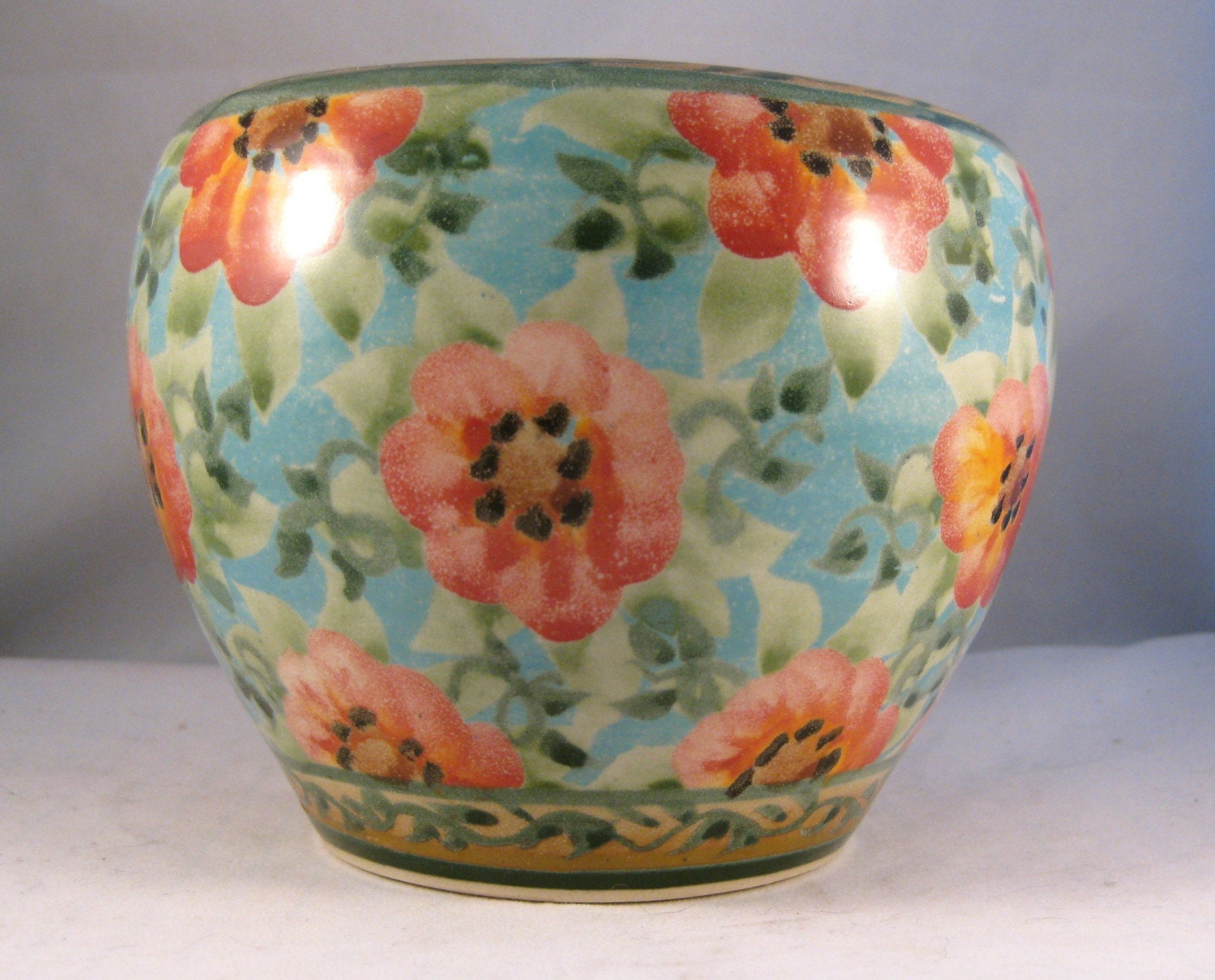
COMPLEMENTARY COLOURS
from Gaialai
from SandyKreyer Kiln House Pottery
HARMONIOUS COLOURS
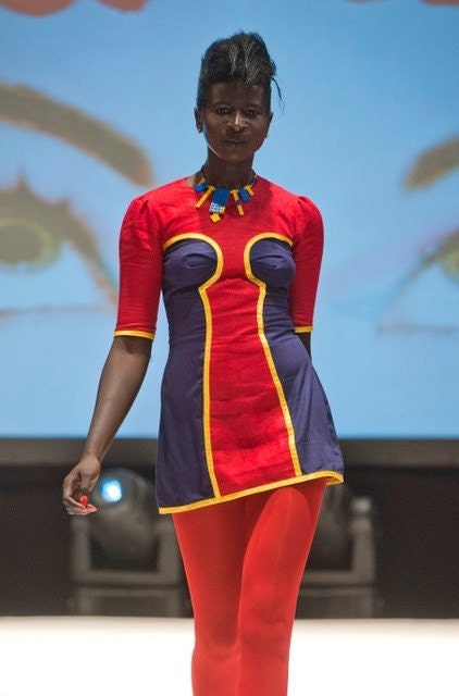
blue, red, and yellow
from
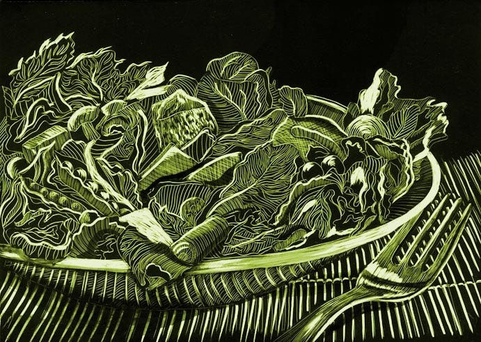
MONOCHROMATIC
Salad Monochromatic, scraperboard,
from naquaiya

from RawHemline
from namolio
Some of my favourite blogs that love colour ;
- Color Collective - http://color-collective.blogspot.com/ - colour palettes of the day
- Cassia Beck http://cassiab.blogspot.com/ - photography with quite a particular palette
- House of Turquoise (Pantone's colour of the year!) - http://www.houseofturquoise.com/
- How about Orange - http://howaboutorange.blogspot.com/
Have fun!!!
Monday, June 21, 2010

Super Scarlet was back in business.
"This is it." thought Scarlet. "Today is the day."
Today was mid-winter solstice. "The longest night means that tomorrow, the days will start getting longer. Time for a spring clean."
She grabbed pencil and paper.
Time to make a to-do list.
Finish 3 more cushions
Make 5 new bags.
Sort some business cards.
Tidy that garden. (oh my, have you seen it of late?)
Sort that bookshelf.
Fix those broken toys.
Do those clothing repairs.
Vacuum that filthy floor.
Wash that school uniform for tomorrow.
Do those dishes...
Oh.
Um, OK. now to prioritise.
Hmmm. She turned the list upside down and sighed.
Sunday, February 28, 2010
mad as a march hare
"Which door should I choose?" wondered Alice.


and she wandered down to Bunnings to have a look.
Friday, February 12, 2010
Love and figs
We are so lucky to have access to a fig tree laden with fruit.

This was one of the figs I opened last night - a fig heart. Sweet, huh?
Fig and ginger jam, caramelised figs, and our very favourite
figs poached in syrup with vanilla and cointreau.
Happy valentine's day x
Subscribe to:
Posts (Atom)